
Cottagecore vs. Dark Academia: Which Style Fits Your Art?
Two aesthetics. Completely different moods.
One wants pressed flowers tucked into journal pages. The other wants ink stains, candlelight, and a bookshelf that looks slightly haunted.
Cottagecore and Dark Academia are everywhere right now, especially in junk journals, printable ephemera, and digital art packs. But they do not create the same feeling at all. Even when they use similar vintage elements, the mood changes everything.
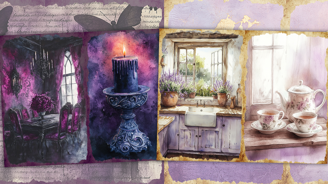
A page filled with soft florals and faded paper feels calm. A page layered with antique sketches and dark typography feels intense. Same vintage inspiration. Totally different energy. Your art style shapes how someone feels before they even notice the details. The colors, textures, fonts, and layouts quietly tell people what kind of world they are stepping into.
Some artists naturally lean toward sunlight and softness. Others want drama, mystery, and cluttered library shelves. Most people already know which one they are. They just have not named it yet.
What Cottagecore Looks Like in Art
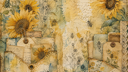
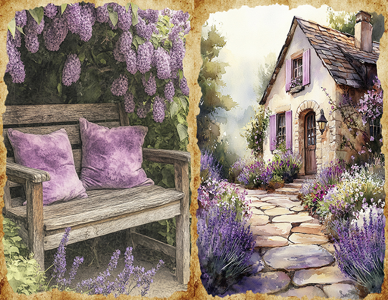
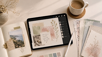
Cottagecore art feels handmade even when it is digital. Nothing looks too perfect, and that is exactly why people love it. Torn edges, faded textures, crooked labels, tiny ink smudges. The page looks like it has lived somewhere before landing on your screen.
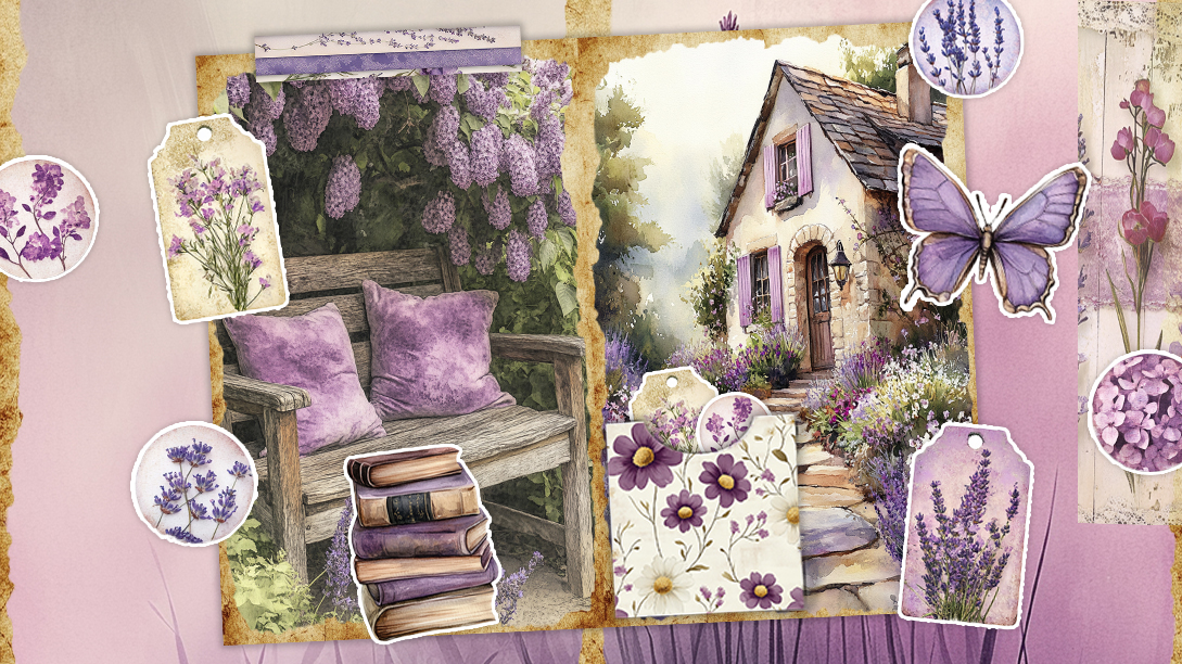
The colors usually stay soft and dusty. Sage green, cream, faded pink, warm brown, muted yellow. Even brighter shades tend to look slightly weathered, like they sat in the sun for years.
The details matter more than the main image
Cottagecore art lives in small details. Pressed flowers tucked behind paper layers. Tea stained journal cards. Handwriting that looks rushed in the best way. Little mushroom sketches. Ribbon textures. Vintage seed packets. Botanical labels.
A Cottagecore junk journal page often feels collected slowly over time instead of designed all at once. That is why the style works so well for printable journals and collage kits. The layered look makes digital pages feel physical.
Cottagecore rarely feels cold
Even messy pages feel comforting. There is usually empty space somewhere on the page. Room for breathing. Room for adding your own notes or scraps later. The layouts feel relaxed instead of tightly controlled.
That softness is what pulls people in. Cottagecore art does not try to impress you immediately. It quietly sits there looking beautiful without demanding attention.
What Dark Academia Looks Like in Art
Dark Academia walks into the room carrying a stack of old books and acting slightly dramatic about it.
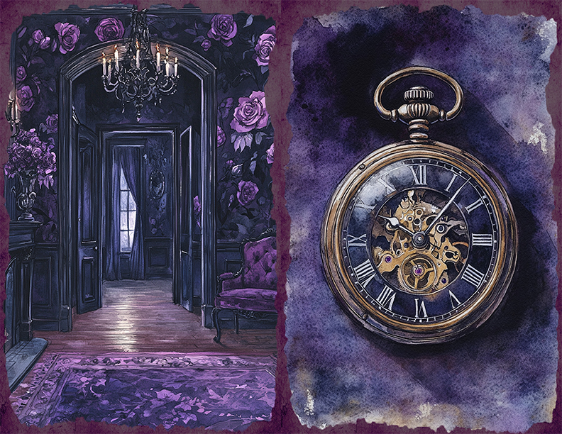
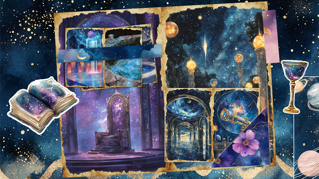
The style leans darker, heavier, and more structured than Cottagecore. Deep brown, charcoal, black, muted gold, dark olive. Even the lighter shades usually feel shadowed somehow.
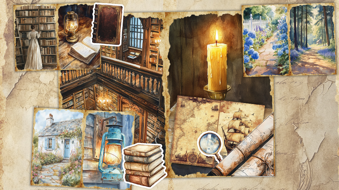
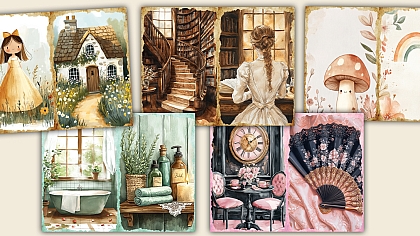
Instead of wildflowers and picnic blankets, the inspiration comes from antique libraries, old universities, faded paintings, vintage science sketches, and handwritten notes stuffed into thick novels.
Dark Academia likes layers
A Dark Academia page rarely looks empty.
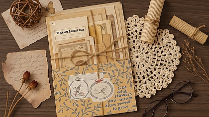
There are usually overlapping textures, crowded collages, torn book pages, typewriter fonts, sketches in the margins, and tiny details hidden everywhere. The eye keeps moving because there is always something else to notice.
That layered look works beautifully in printable journals and digital collage packs because it makes everything feel rich and collected. One small journal card can suddenly look like it belongs inside a forgotten archive.
The mood feels more intense
Cottagecore feels soft around the edges. Dark Academia feels sharper.
The layouts often look more intentional and symmetrical. The contrast is stronger. Shadows matter more. Even blank space feels serious instead of airy.
A lot of Dark Academia art also pulls from academic themes. Astronomy charts, anatomy sketches, classical statues, poetry fragments, old maps, fountain pen writing. The style romanticizes curiosity in a very dramatic way.
That is probably why people either become obsessed with it instantly or feel absolutely nothing toward it.
The biggest difference is the feeling
This is where people usually realise which style actually fits them.
Cottagecore is about comfort. Dark Academia is about fascination.
One wants slow mornings, handmade paper, and soft lighting. The other wants rainy evenings, crowded notebooks, and the feeling of staying awake too late while working on something interesting.
Cottagecore feels like escape
There is a quietness to it.
The pages often feel nostalgic without trying too hard. Nature plays a huge role. Flowers, herbs, birds, forests, gardens. Even the messiness feels peaceful.
People drawn to Cottagecore art usually enjoy creating pages that feel personal and relaxed rather than visually intense.
Dark Academia feels like obsession
Dark Academia has more tension in it.
The style loves mystery, ambition, intelligence, and slightly dramatic beauty. It romanticizes learning, collecting, researching, writing, highlighting pages in books you swear you are going to finish.
The art often feels moodier because the entire aesthetic is built around atmosphere first and comfort second.
And honestly, most artists naturally create better work when the mood actually matches their personality instead of whatever aesthetic happened to trend on Pinterest that week.
Which Style Works Better for Junk Journals?
Honestly, both work beautifully for junk journals. They just create completely different reading experiences.
A Cottagecore journal feels like something you would find in a wooden drawer beside dried flowers and old letters. A Dark Academia journal feels like it was discovered under a stack of dusty books in a forgotten library corner.
Same concept. Totally different atmosphere.
Cottagecore journals feel softer and more personal
Cottagecore works especially well for memory keeping, seasonal journals, nature themes, travel pages, and gentle scrapbook layouts.
The style gives pages breathing room. You can layer tags, florals, stamps, and textured paper without making the spread feel crowded. Even beginner journal makers usually find Cottagecore easier to work with because imperfections actually improve the look.
A slightly crooked label suddenly feels charming instead of wrong.
That is why Cottagecore printable kits tend to include things like:
- Floral ephemera
- Botanical labels
- Vintage recipe cards
- Nature sketches
- Soft patterned paper
- Handwritten textures
The overall feeling stays relaxed and collected.
Dark Academia journals feel richer and heavier
Dark Academia journals usually look more detailed from the start.
The pages often include stacked paper layers, darker textures, old document scans, sketches, poetry fragments, library cards, and antique typography. Everything feels slightly fuller.
This style works especially well for:
- Reading journals
- Poetry spreads
- Study journals
- Literary themed scrapbooks
- Vintage collage layouts
- Moodier printable packs
Dark Academia also handles clutter differently. Cottagecore clutter feels airy. Dark Academia clutter feels intentional, almost obsessive in places.
That tension is part of the appeal.
A heavily layered Dark Academia spread can feel cinematic when it is done well. Like a page pulled from somebody’s notebook halfway through a mystery novel.
How to Tell Which One Fits Your Art Style
The easiest way to figure it out is to stop looking at trends and look at what you naturally save.
Not what you think looks impressive. What you actually return to over and over again.
Look at your instincts
When you start a new page, what do you reach for first?
Cream paper or black paper? Tiny flowers or old book text? Soft lace textures or fountain pen sketches?
Your taste usually answers the question long before your brain does.
Your workspace probably already gives it away
People with Cottagecore taste often surround themselves with soft things. Plants, natural lighting, warm textures, messy desks that somehow still feel calm.
Dark Academia people somehow manage to make coffee cups, stacked books, and low lighting look like part of the aesthetic.
Even the playlists are different. One sounds like spring mornings. The other sounds like somebody dramatically studying by candlelight during a thunderstorm.
And yes, that matters more than people admit.
You Can Mix Them Without Ruining Either
A lot of artists naturally sit somewhere in the middle.
Not every page has to choose between soft meadow energy and mysterious library energy like it is joining a team. Some of the most interesting journal spreads combine both styles without looking confused.
That mix usually works best when one aesthetic leads and the other adds texture.
Cottagecore with darker details
Soft florals look completely different once you pair them with aged paper, darker typography, or antique sketches.
A botanical page can shift from sweet to moody very quickly with:
- Deep brown backgrounds
- Vintage handwriting
- Mushroom illustrations
- Dark green accents
- Old scientific labels
The page still feels natural, just less delicate.
Dark Academia can soften beautifully too
Dark Academia sometimes becomes too heavy if every element feels dark and crowded. Adding softer textures can make the layout feel richer instead of overwhelming.
Cream paper, faded florals, linen textures, or lighter empty space can stop the page from looking visually exhausted.
That balance works especially well for printable journal kits because it appeals to people who like vintage aesthetics but do not want pages that feel too intense.
The overlap is larger than people think
Both aesthetics love vintage paper, aged textures, handwritten details, and nostalgia. They simply romanticize different worlds.
Cottagecore romanticizes simplicity.
Dark Academia romanticizes curiosity.
That is why they blend together surprisingly well when the colors and textures feel intentional.
The Best Style Is the One You Actually Want to Create Again
Some people force themselves into aesthetics that look impressive online but feel exhausting to make.
That never lasts.
The best art style is usually the one you naturally return to when nobody is watching. The one that makes you want to open your journal again tomorrow instead of abandoning it after one pretty page.
If you keep reaching for soft florals, faded paper, and warm natural colors, Cottagecore is probably already part of your creative style.
If you collect vintage book pages, dark textures, sketches, and dramatic layouts without even thinking about it, Dark Academia probably fits you better than you realised.
And if your folders are full of both, you are definitely not the only one.
Some artists want sunlight through linen curtains. Others want candlelight falling across stacked books.
Most people already know which one feels like home.
LEAVE A COMMENT

0.1373